To design the form, you must place on it all the controls you want to display to the user at runtime. The controls are the components of the Windows interface (buttons, text boxes, radio buttons, lists, and so on). Open the Toolbox by moving the pointer over the Toolbox tab at the far left; the Toolbox, shown in Figure 1.4, pulls out. This Toolbox contains an icon for each control you can use on your form.
The controls are organized into groups according to each control’s function on the interface. In the first part of the tutorial, we’ll create simple Windows applications and we’ll use the controls on the Common Controls tab. When you develop web applications, you will see a different set of icons in the Toolbox.
To place a control on the form, you can double-click the icon of the control. A new instance with a default size will be placed on the form. Then you can position and resize it with the mouse. Or you can select the control from the Toolbox with the mouse and then click and drag the mouse over the form and draw the outline of the control. A new instance of the control will be placed on the form, and it will fill the rectangle you specified with the mouse. Start by placing a TextBox control on the form.
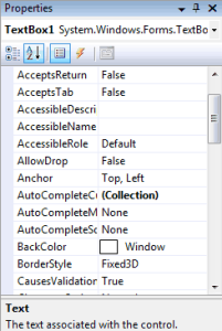
The control’s properties will be displayed in the Properties window (see Figure 1.5). This window, at the far right edge of the IDE and below the Solution Explorer, displays the properties of the selected control on the form. If the Properties window is not visible, open the View menu and choose PropertiesWindow, or press F4. If no control is selected, the properties of the selected item in the Solution Explorer are displayed.

Figure 1.4 – Visual Basic 2008 ToolBox window
In the Properties window, also known as the Properties Browser, you see the properties that determine the appearance of the control and (in some cases) its function. The properties are organized in categories according to their role. The properties that determine the appearance of the control are listed alphabetically under the header Appearance, the properties that determine the control’s behavior are listed alphabetically under the header Behavior, and so on. You can click the AZ button on the window’s title bar to display all properties in alphabetical order. After you familiarize yourself with the basic properties, you will most likely switch to the alphabetical list.
Locate the TextBox control’s Text property and set it to My TextBox Control by entering the string into the box next to the property name. The control’s Text property is the string that appears in the control (the control’s caption), and most controls have a Text property.
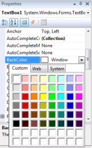
Next locate its BackColor property and select it with the mouse. A button with an arrow appears next to the current setting of the property. Click this button, and you’ll see a dialog box with three tabs (Custom, Web, and System), as shown in Figure 1.6. In this dialog box, you can select the color that will fill the control’s background. Set the control’s background color to yellow and notice that the control’s appearance changes on the form.
One of the settings you’ll want to change is the font of the various controls. While the TextBox control is still selected on the form, locate the control’s Font property in the Properties window. You can click the plus sign in front of the property name and set the individual properties of the font, or you can click the ellipsis button to invoke the Font dialog box. Here you can set the control’s font and its attributes and then click OK to close the dialog box. Set the TextBox control’s Font property to Verdana, 14 points, bold. As soon as you close the Font dialog box, the control on the form is adjusted to the new setting.
There’s a good chance that the string you assigned to the control’s Text property won’t fit in the control’s width when rendered in the new font. Select the control on the form with the mouse, and you will see eight handles along its perimeter. Rest the pointer over any of these handles, and it will assume a shape indicating the direction in which you can resize the control. Make the control long enough to fit the entire string. If you have to, resize the form as well. Click somewhere on the form, and when the handles along its perimeter appear, resize it with the mouse.
Some controls, such as the Label, Button, and CheckBox controls, support the AutoSize property, which determines whether the control is resized automatically to accommodate its caption. The TextBox control, as well as many others, doesn’t support the AutoSize property. If you attempt to make the control tall enough to accommodate a few lines of text, you’ll realize that you can’t change the control’s height. By default, the TextBox control accepts a single line of text, and you must set its MultiLine property to True to resize the TextBox control vertically.

Figure 1.5 – Properties of a TextBox Control

Figure 1.6 – Setting a color property in the Properties Window
So far, you’ve manipulated properties that determine the appearance of the control. Now you’ll change a property that determines not only the appearance, but also the function of the control. Locate the Multiline property. Its current setting is False. Expand the list of available settings and change it to True. (You can also change it by double-clicking the name of the property. This action toggles the True/False settings.) Switch to the form, select the TextBox control, and make it as tall as you wish.
The Multiline property determines whether the TextBox control can accept one (if Multiline = False) or more (if Multiline = True) lines of text. Set this property to True, go back to the Text property, set it to a long string, and press Enter. The control breaks the long text intomultiple lines. If you resize the control, the lines will change, but the entire string will fit in the control because the control’s WordWrap property is True. Set it to False to see how the string will be rendered on the control.
Multiline TextBox controls usually have a vertical scroll bar so users can quickly locate the section of text that they’re interested in. Locate the control’s ScrollBars property and expand the list of possible settings by clicking the button with the arrow. This property’s settings are None, Vertical, Horizontal, and Both. Set it to Vertical, assign a very long string to its Text property, and watch how the control handles the text. At design time, you can’t scroll the text on the control; if you attempt to move the scroll bar, the entire control will be scrolled. The scroll bar will work as expected at runtime (it will scroll the text vertically).
You can also make the control fill the entire form. Start by deleting all other controls you may have placed on the form and then select the multiline TextBox. Locate the Dock property in the Properties window and keep double-clicking the name of the property until its setting changes to Fill. (You’ll learn a lot more about docking controls in Chapter, ‘‘Working with Forms.’’) The TextBox control fills the form and is resized as you resize the form, both at design time and runtime.
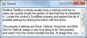
To examine the control’s behavior at runtime, press F5. The application will be compiled, and a few moments later, a window filled with a TextBox control will appear on the Desktop (like the one shown in Figure 1.7). This is what the users of your application would see (if this were an application worth distributing, of course).

Figure 1.7 – A TextBox control displaying multiple text lines
Enter some text on the control, select part of the text, and copy it to the Clipboard by pressing Ctrl+C. You can also copy text from any other Windows application and paste it on the TextBox control. Right-click the text on the control and you will see the same context menu you get with Notepad; you can even change the reading order of the text— not that you’d want to do that with a Western language. When you’re finished, open the Debug menu and choose Stop Debugging.
This will terminate your application’s execution, and you’ll be returned to the IDE. The Stop Debugging command is also available as a button with a blue square icon on the toolbar. Finally, you can stop the running application by clicking the Close button in the application’s window.
The design of a new application starts with the design of the application’s form, which is the application’s user interface, or UI. The design of the form determines to a large extent the functionality of the application. In effect, the controls on the form determine how the application will interact with the user. The form itself is a prototype, and you can demonstrate it to a customer before even adding a single line of code. By placing controls on the form and setting their properties, you’re implementing a lot of functionality before coding the application. The TextBox control with the settings discussed in this section is a functional text editor.


