A common issue in form design is the design of forms that are properly resized. For instance, you might design a nice form for a given size, but when it’s resized at runtime, the controls are all clustered in the top-left corner. Or a TextBox control that covers the entire width of the form at design time suddenly “cringes” on the left when the user drags out the window. If the user makes the form smaller than the default size, part of the TextBox could be invisible because it’s outside the form. You can attach scroll bars to the form, but that doesn’t really help — who wants to type text and have to scroll the form horizontally? It makes sense to scroll vertically because you get to see many lines at once, but if the TextBox control is wider than the form, you can’t read entire lines.
Anchoring Controls
The Anchor property lets you attach one or more edges of the control to corresponding edges of the form. The anchored edges of the control maintain the same distance from the corresponding edges of the form.
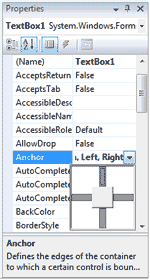
Place a TextBox control on a new form, set its MultiLine property to True, and then open the control’s Anchor property in the Properties window. You will see a rectangle within a larger rectangle and four pegs that connect the small control to the sides of the larger box (see Figure 5.5). The large box is the form, and the small one is the control. The four pegs are the anchors, which can be either white or gray. The gray anchors denote a fixed distance between the control and the form. By default, the control is placed at a fixed distance from the top-left corner of the form. When the form is resized, the control retains its size and its distance from the top-left corner of the form.

Figure 5.5 – The settings of the Anchor property
We want our TextBox control to fill the width of the form, be aligned to the top of the form, and leave some space for a few buttons at the bottom. We also want our form to maintain this arrangement, regardless of its size. Make the TextBox control as wide as the form (allowing, perhaps, a margin of a few pixels on either side). Then place a couple of buttons at the bottom of the form and make the TextBox control tall enough that it stops above the buttons. This is the form of the Anchor property example project.
Now open the TextBox control’s Anchor property and make all four anchors gray by clicking them. This action tells the Form Designer to resize the control accordingly at runtime, so that the distances between the sides of the control and the corresponding sides of the form are the same as those you set at design time. Select each button on the form and set their Anchor properties in the Properties window: Anchor the left button to the left and bottom of the form, and the right button to the right and bottom of the form.
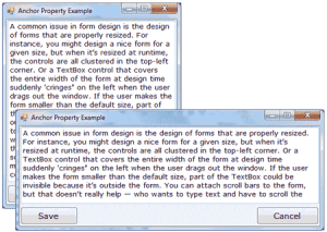
Resize the form at design time without running the project, and you’ll see that all the controls are resized and rearranged on the form at all times. Figure 5.6 shows the Anchor project’s main form in two different sizes.

Figure 5.6 – Use the Anchor property of the various controls to design forms that can be resized gracefully at runtime.
Yet, there’s a small problem: If you make the form very narrow, there will be no room for both buttons across the form’s width. The simplest way to fix this problem is to impose a minimum size for the form. To do so, you must first decide the form’s minimum width and height and then set the MinimumSize property to these values. You can also use the AutoScroll properties, but it’s not recommended that you add scroll bars to a small form like ours.
Docking Controls
In addition to the Anchor property, most controls provide the Dock property, which determines how a control will dock on the form. The default value of this property is None.
Create a new form, place a multiline TextBox control on it, and then open the control’s Dock property. The various rectangular shapes are the settings of the property. If you click the middle rectangle, the control will be docked over the entire form: It will expand and shrink both horizontally and vertically to cover the entire form. This setting is appropriate for simple forms that contain a single control, usually a TextBox, and sometimes a menu. Try it out.
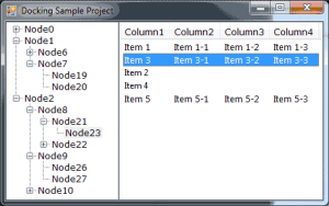
Let’s create a more complicated form with two controls (see the Docking sample project). The form shown in Figure 5.7 contains a TreeView control on the left and a ListView control on the right. The two controls display folder and file data on an interface that’s very similar to that of Windows Explorer. The TreeView control displays the directory structure, and the ListView control displays the selected folder’s files.

Figure 5.7 – Setting the Dock property of the controls to Fill so the form at runtime will be filled with controls even when it is re-sized
Place a TreeView control on the left side of the form and a ListView control on the right side of the form. Then dock the TreeView to the left and the ListView to the right. If you run the application now, as you resize the form, the two controls remain docked to the two sides of the form — but their sizes don’t change. If you make the form wider, there will be a gap between the two controls. If you make the form narrower, one of the controls will overlap the other.
End the application, return to the Form Designer, select the ListView control, and set its Dock property to Fill. This time, the ListView will change size to take up all the space to the right of the TreeView. The ListView control will attempt to fill the form, but it won’t take up the space of another control that has been docked already. The TreeView and ListView controls are discussed in the section, “The TreeView and ListView Controls“; that’s why I’ve populated them with some fake data at design time. In section, “The TreeView and ListView Controls”, you’ll learn how to populate these two controls at runtime with folder names and filenames, respectively, and build a custom Windows Explorer.


