The form behaves better, but it’s not what you really expect from a Windows application. The problem with the form in Figure 5.7 in the section “Anchoring and Docking Controls to a Form” is that users can’t change the relative widths of the controls. In other words, they can’t make one of the controls narrower to make room for the other, which is a fairly common concept in the Windows interface.
The narrow bar that allows users to control the relative sizes of two controls is a splitter. When the cursor hovers over a splitter, it changes to a double arrow to indicate that the bar can be moved. By moving the splitter, you can enlarge one of the two controls while shrinking the other. The Form Designer provides a special control for placing a splitter between two controls: the SplitContainer control. We’ll design a new form with two TextBoxes and a splitter between them so that users can change the relative size of the two controls.
First, place a SplitContainer control on the form. The SplitContainer consists of two Panels, the Panel1 and Panel2 controls, and a vertical splitter between them. This is the default configuration; you can change the orientation of the splitter by using the control’s Orientation property. Also by default, the two panels of the Splitter control are resized proportionally as you resize the form. If you want to keep one of the panels fixed and have the other take up the rest of the form, set the control’s FixedPanel property to the name of the panel you want to retain its size.
Next, place a TextBox control in the left panel of the SplitControl and set its Multiline property to True. You don’t need to do anything about its size because we’ll dock it in the panel to which it belongs. With the TextBox control selected, locate its Dock property and set it to Fill. The TextBox control will fill the left panel of the SplitContainer control. Do the same with another TextBox control, which will fill the right panel of the SplitContainer control. Set this control’s Multiline property to True and its Dock property to Fill.
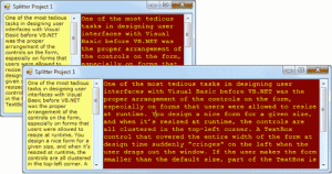
Now run the project and check out the functionality of the SplitContainer. Paste some text on the two controls and then change their relative sizes by sliding the splitter between them, as shown in Figure 5.8. We’ll call this example as Splitter Project 1.

Figure 5.8 – The SplitContainer control lets you change the relative size of the controls on either side.
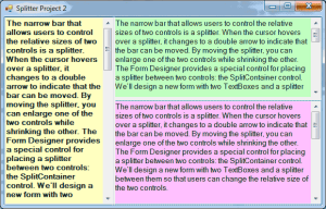
Let’s design a more elaborate form with two SplitContainer controls, such as the one shown in Figure 5.9. (we’ll call this the Splitter Project 2.) This form, which resembles the interface of Microsoft Office Outlook, consists of a TreeView control on the left (where the folders are displayed), a ListView control (where the selected folder’s items are displayed), and a TextBox control (where the selected item’s details are displayed). I’m using three TextBox controls with different background colors; the process of designing the form is identical, regardless of the controls you put on it.

Figure 5.9 – An elaborate form with two splitter controls
Start by placing a SplitContainer control on the form. Then place a multiline TextBox control on the left panel of the SplitContainer control and set the TextBox control’s Dock property to Fill. The TextBox control will fill the left panel of the SplitContainer control. Place another SplitContainer in the right panel of the first SplitContainer control. This control will be automatically docked in its panel and will fill it. Its orientation, however, is vertical, and the splitter will separate the panel into two smaller vertical panes. Select the second SplitContainer control, locate its Orientation property in the Properties window, and set it to Horizontal.
Now you can fill each of the panels with a TextBox control. Set each TextBox control’s BackgroundColor to a different color, its MultiLine property to True, and its Dock property to Fill. The TextBox controls will fill their containers, which are the panels of the two SplitContainer controls, not the form. If you look up the properties of a SplitContainer control, you’ll see that it’s made up of two Panel controls, which are exposed as properties of the SplitContainer control, the Panel1 and Panel2 controls. You can set many of the properties of these two constituent controls, such as their font and color, their minimum size, and so on. They even expose an AutoScroll property, so that users can scroll the contents of each one independently of the other. You can also set other properties of the SplitContainer control, such as the SplitterWidth property, which is the width of the splitter bar between the two panels in pixels, and the SplitterIncrement property, which is the smallest number of pixels that the splitter bar can be moved in either direction.
So far, you’ve seen what the Form Designer and the Form object can do for your application. Let’s switch our focus to programming forms and explore the events triggered by the Form object.


