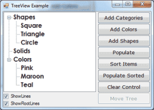
Let’s start our discussion of TreeView control with a few simple properties that you can set at design time. To experiment with the properties discussed in this section, open the TreeView Example project. The project’s main form is shown in Figure 4.25. After setting some properties (they are discussed next), run the project and click the Populate button to populate the control. After that, you can click the other buttons to see the effect of the various property settings on the control.

Figure 4.25 – The TreeView Example project demonstrates the basic properties and methods of the TreeView control.
Here are the basic properties that determine the appearance of the control:
- ShowCheckBoxes – If this property is True, a check box appears in front of each node. If the control displays check boxes, you can select multiple nodes; otherwise, you’re limited to a single selection.
- FullRowSelect – This True/False value determines whether a node will be selected even if the user clicks outside the node’s caption.
- HideSelection – This property determines whether the selected node will remain highlighted when the focus is moved to another control. By default, the selected node doesn’t remain highlighted when the control loses the focus.
- HotTracking – This property is another True/False value that determines whether nodes are highlighted as the pointer hovers over them.When it’s True, the TreeView control behaves like a web document with the nodes acting as hyperlinks — they turn blue while the pointer hovers over them. Use the NodeMouseHover event to detect when the pointer hovers over a node.
- Indent – This property specifies the indentation level in pixels. The same indentation applies to all levels of the tree—each level is indented by the same number of pixels with respect to its parent level.
- PathSeparator – A node’s full name is made up of the names of its parent nodes, separated by a backslash. To use a different separator, set this property to the desired symbol.
- ShowLines – The ShowLines property is a True/False value that determines whether the control’s nodes will be connected to its parent items with lines. These lines help users visualize the hierarchy of nodes, and it’s customary to display them.
- ShowPlusMinus – The ShowPlusMinus property is a True/False value that determines whether the plus/minus button is shown next to the nodes that have children. The plus button is displayed when the node is collapsed, and it causes the node to expand when clicked. Likewise, the minus sign is displayed when the node is expanded, and it causes the node to collapse when clicked. Users can also expand the current node by pressing the left-arrow button and collapse it with the right-arrow button.
- ShowRootLines – This is another True/False property that determines whether there will be lines between each node and root of the tree view. Experiment with the ShowLines and ShowRootLines properties to find out how they affect the appearance of the control.
- Sorted – This property determines whether the items in the control will be automatically sorted. The control sorts each level of nodes separately. In our Globe example, it will sort the continents, then the countries within each continent, and then the cities within each country.


