

Let’s look now at the process of populating the TreeView control. Adding an initial collection of nodes to a TreeView control at design time is trivial. Locate the Nodes property in the Properties window, and you’ll see that its value is Collection. To add items, click the ellipsis button, and the TreeNode Editor dialog box will appear, as shown in Figure 4.26. To add a root item, just click the Add Root button. The new item will be named Node0 by default. You can change its caption by selecting the item in the list and setting its Text property accordingly. You can also change the node’s Name property, as well as the node’s appearance by using the NodeFont, FontColor, and ForeColor properties.
To specify an image for the node, set the control’s ImageList property to the name of an ImageList control that contains the appropriate images, and then set either the node’s ImageKey property to the name of the image, or the node’s ImageIndex property to the index of the desired image in the ImageList control. If you want to display a different image when the control is selected, set the SelectedImageKey or the SelectedImageIndex property accordingly.
You can add root items by clicking the Add Root button, or you can add items under the selected node by clicking the Add Child button. Follow these steps to enter the root node with the string Countries, a child node for United States, and two or more nodes under United States: New York, California, Washington etc. I’m assuming that you’re starting with a clean control. If your TreeView control contains any items, clear them all by selecting one item at a time in the list and pressing the Delete key, or clicking the delete button (the one with the X icon) on the dialog box.
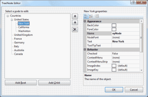
Figure 4.26 – The TreeNode Editor dialog box
Click the Add Root button first. A new node is added automatically to the list of nodes, and it is named Node0. Select it with the mouse, and its properties appear in the right pane of the TreeNode Editor window. Here you can change the node’s Text property to Countries. You can specify the appearance of each node by setting its font and fore/background colors.
Then click the Add Child button, which adds a new node under the GLOBAL root node. Select it with the mouse as before, and change its Text property to United States. Then select the newly added node in the list and click the Add Child button again. Name the new node With a state name, for example New York. You’ve successfully added a small hierarchy of nodes. To add another node under United States, select the United States node in the list and click the Add Child button again. Name the new item California.
Continue adding a few states under each country. You might add child nodes under the wrong parent, which can happen if you forget to select the proper parent node before clicking the Add Child button. To delete a node, select it with the mouse and click the Delete button. Note that when a node is deleted, all the nodes under it are deleted, too. Moreover, this action can’t be undone. So be careful when deleting nodes.
Click the OK button to close the TreeNode Editor’s window and return to your form. The nodes you added to the TreeView control are there, but they’re collapsed. Only the root nodes are displayed with the plus sign in front of their names. Click the plus sign to expand the tree and see its child nodes. The TreeView control behaves the same at design time as it does at runtime — as far as navigating the tree goes, at least.
The nodes added to a TreeView control at design time will appear each time the form is loaded. You can add new nodes through your code, and you will see how this is done in the following section “Adding Nodes at Runtime in VB 2008”.