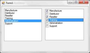
The ListBox, CheckedListBox, and ComboBox controls present lists of choices, from which the user can select one or more. The ListBox control occupies a user-specified amount of space on the form and is populated with a list of items. If the list of items is longer than can fit on the control, a vertical scroll bar appears automatically.

The CheckedListBox control is a variation of the ListBox control. It’s identical to the ListBox control, but a check box appears in front of each item. The user can select any number of items by selecting the check boxes in front of them. As you know, you can also select multiple items from a ListBox control by pressing the Shift and Ctrl keys.
The ComboBox control also contains multiple items but typically occupies less space on the screen. The ComboBox control is an expandable ListBox control: The user can expand it to make a selection, and collapse it after the selection is made. The real advantage of the ComboBox control, however, is that the user can enter new information in the ComboBox, rather than being forced to select from the items listed.
To add items at design time, locate the Items property in the control’s Properties window and click the ellipsis button. A new window will pop up — the String Collection Editor window — in which you can add the items you want to display in the list. Each item must appear on a separate text line, and blank text lines will result in blank lines in the list. These items will appear in the list when the form is loaded, but you can add more items (or remove existing ones) from within your code at any time. They appear in the same order as entered on the String Collection Editor window unless the control has its Sorted property set to True, in which case the items are automatically sorted, regardless of the order in which you’ve specified them.
This section first examines the ListBox control’s properties and methods. Later, you’ll see how the same properties and methods can be used with the ComboBox control.
Basic Properties The ListBox, CheckedListBox, and ComboBox Controls
In this section, you’ll find the properties that determine the functionality of the three controls. These properties are usually set at design time, but you can change their setting from within your application’s code.
IntegralHeight
This property is a Boolean value (True/False) that indicates whether the control’s height will be adjusted to avoid the partial display of the last item. When set to True, the control’s actual height changes in multiples of the height of a single line, so only an integer number of rows are displayed at all times.
Items
The Items property is a collection that holds the control’s items. At design time, you can populate this list through the String Collection Editor window. At runtime, you can access and manipulate the items through the methods and properties of the Items collection, which are described shortly.
MultiColumn
A ListBox control can display its items in multiple columns if you set its MultiColumn property to True. The problem with multicolumn ListBoxes is that you can’t specify the column in which each item will appear. ListBoxes with many items and their MultiColumn property set to True expand horizontally, not vertically. A horizontal scroll bar will be attached to a multicolumn ListBox, so that users can bring any column into view. This property does not apply to the ComboBox control.
SelectionMode
This property, which applies to the ListBox and CheckedListBox controls only, determines how the user can select the list’s items. The possible values of this property—members of the SelectionMode enumeration— are shown in Table 4.3.
| Value | Description |
|---|---|
| None | No selection at all is allowed. |
| One | (Default) Only a single item can be selected. |
| MultiSimple | Simple multiple selection: A mouse click (or pressing the spacebar) selects or deselects an item in the list. You must click all the items you want to select. |
| MultiExtended | Extended multiple selection: Press Shift and click the mouse (or press one of the arrow keys) to expand the selection. This process highlights all the items between the previously selected item and the current selection. Press Ctrl and click the mouse to select or deselect single items in the list. |
Sorted
When this property is True, the items remain sorted at all times. The default is False, because it takes longer to insert new items in their proper location. This property’s value can be set at design time as well as runtime.
The items in a sorted ListBox control are sorted in ascending and case-sensitive order. Uppercase characters appear before the equivalent lowercase characters, but both upper and lowercase characters appear together. All words beginning with B appear after the words beginning with A and before the words beginning with C. Within the group of words beginning with B, those beginning with a capital B appear before those beginning with a lowercase b. This sorting order is known as phone tutorial order.
Moreover, the ListBox control won’t sort numeric data. The number 10 will appear in front of the number 5 because the string 10 is smaller than the string 5. If the numbers are formatted as 010 and 005, they will be sorted correctly.
Text
The Text property returns the selected text on the control. Although you can set the Text property for the ComboBox control at design time, this property is available only at runtime for the other two controls. Notice that the items need not be strings. By default, each item is an object. For each object, however, the control displays a string, which is the same string returned by the object’s ToString method.


