The ComboBox control is similar to the ListBox control in the sense that it contains multiple items and the user may select one, but it typically occupies less space onscreen. The ComboBox is practically an expandable ListBox control, which can grow when the user wants to make a selection and retract after the selection is made. Normally, the ComboBox control displays one line with the selected item, as this control doesn’t allow multiple item selection. The essential difference, however, between ComboBox and ListBox controls is that the ComboBox allows the user to specify items that don’t exist in the list.
There are three types of ComboBox controls. The value of the control’s Style property determines which box is used; these values are shown in Table 4.4.
Table 4.4 – Styles of the ComboBox Control
| Value | Effect |
|---|---|
| DropDown | (Default) The control is made up of a drop-down list, which is visible at all times, and a text box. The user can select an item from the list or type a new one in the text box. |
| DropDownList | This style is a drop-down list from which the user can select one of its items but can’t enter a new one. The control displays a single item, and the list is expanded as needed. |
| Simple | The control includes a text box and a list that doesn’t drop down. The user can select from the list or type in the text box. |
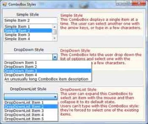
The ComboBox Styles project, shown in Figure 4.6, demonstrates the three styles of the ComboBox control. This is another common element of the Windows interface, and its properties and methods are identical to those of the ListBox control. Load the ComboBox Styles project in the Visual Basic IDE and experiment with the three styles of the ComboBox control.
The DropDown and Simple ComboBox controls allow the user to select an item from the list or enter a new one in the edit box of the control. Moreover, they’re collapsed by default and they display a single item, unless the user expands the list of items to make a selection. The DropDownList ComboBox is similar to a ListBox control in the sense that it restricts the user to selecting an item (the user cannot enter a new one). However, it takes much less space on the form than a ListBox does, because normally it displays a single item. When the user wants to make a selection, the DropDownList expands to display more items. After the user has made a selection, the list contracts to a single line again.

Figure 4.6 – VB.NET ComboBox control’s Simple style, DropDown style and DropDownList style.
Most of the properties and methods of the ListBox control also apply to the ComboBox control. The Items collection gives you access to the control’s items, and the SelectedIndices and SelectedItems collections give you access to the items in the current selection. If the control allows only a single item to be selected, use the properties SelectedIndex and SelectedItem. You can also use the FindString and FindStringExact methods to locate any item in the control.
There’s one aspect worth mentioning regarding the operation of the control. Although the edit box at the top allows you to enter a new string, the new string doesn’t become a new item in the list. It remains there until you select another item or you clear the edit box. You can provide some code to make any string entered by the user in the control’s edit box be added to the list of existing items.
The most common use of the ComboBox control is as a lookup table. The ComboBox control takes up very little space on the form, but it can be expanded at will. You can save even more space when the ComboBox is contracted by setting it to a width that’s too small for the longest item. Use the DropDownWidth property, which is the width of the segment of the drop-down list. By default, this property is equal to the control’s Width property. The second ComboBox control in Figure 6.8 contains an unusually long item. The control is wide enough to display the default selection. When the user clicks the arrow to expand the control, the drop-down section of the control is wider than the default width, so that the long items can be read.


