Some of the most interesting and fun parts of a programming language are its graphics elements. In general, graphics fall into two major categories: vector and bitmap. Vector graphics are images generated by graphics methods such as DrawLine and DrawEllipse. The drawing you create is based on mathematical descriptions of the various shapes. Bitmap graphics are images made up of pixels arranged in rows and columns. Each pixel is represented by a Long numeric value, which is the pixel’s color. The difference between vector and bitmap graphics is that vector graphics aren’t tied to a specific monitor resolution; that is, they can be displayed at various resolutions. Bitmap graphics, on the other hand, have a fixed resolution. An image that is 1,024 pixels wide and 768 pixels tall has that specific resolution. If you attempt to use that image to fill a monitor that’s 1,280 pixels wide and 1,024 pixels tall, you’ll have to repeat some pixels. Image-processing software can interpolate between pixels, but when you blow up a bitmap, you see its block-like structure.
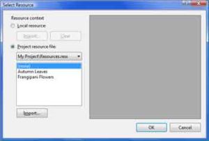
The primary control for displaying images is the PictureBox control. To load an image to a PictureBox control, locate the Image property in the Properties window and click the button with the ellipsis next to it. The Select Resource dialog box will appear, in which you can select the image to be displayed (see Figure 14.1). The image, along with every other image or icon you use in the same project, is stored in the Resources folder under the project’s folder. As a result, you don’t have to distribute the image with your application; it will be included in the setup file that the installer will create for your application.
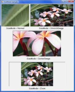
After the image is loaded, you must make sure that it fills the available space. The PictureBox control exposes the SizeMode property,which determines how the image will be sized and aligned on the control. The SizeMode property can be set to a member of the PictureBoxSizeMode enumeration: AutoSize, CenterImage, Normal, StretchImage, and Zoom. Its default setting is Normal, and in this mode the control displays the image at its normal magnification. If the image is larger than the control, part of the image will be invisible. If the image is smaller than the control, part of the control will be empty. In this case, you can set the SizeMode property to CenterImage to center the image on the control.

The StretchImage setting resizes the image so that it fills the control. If the control’s aspect ratio isn’t the same as the aspect ratio of the image, the image will be distorted in the process. If you want to use the StretchImage setting, you must also resize one of the dimensions of the control, so that the image will be properly resized. You’ll see how to do this shortly. The AutoSize setting causes the control to be resized according to the image’s dimensions. This is not the most convenient setting because the control might cover other controls on the form.
The Zoom setting of the SizeMode property resizes the image without distorting its aspect ratio. In this mode, the control attempts to resize the image as well as it can in the given area while maintaining its aspect ratio. If the image’s aspect ratio is different from the aspect ratio of the control, this setting will fill the control vertically or horizontally and will center the image in the other direction.
Figure 14.3 shows a PictureBox control with an image in four of the five settings (the AutoSize mode, which isn’t shown in the figure, stretches the PictureBox control to the size of the image) Notice that the Zoom mode filled the PictureBox vertically, but left a margin on either side of the image to avoid distortion of the image’s aspect ratio.
Designing a Scrolling PictureBox
A problem with the PictureBox control is that it doesn’t provide an AutoScroll property; thus you can’t display a large image at its original resolution and scroll any part of it into view at runtime. A scrollable PictureBox would be highly desirable in many applications (images are so common in many types of applications today), but because the control doesn’t support this functionality, here’s the next best thing you can do:
- Place a Panel control on the form and set its AutoSize property to True. Set its AutoScroll property to True also, so that the appropriate scroll bars will appear automatically as soon as the control’s contents exceed its dimensions. Finally, set it Dock property to Fill, so that it will cover the entire form.
- Place a PictureBox control on the Panel control and set its SizeMode property to AutoSize. We want the PictureBox control to be sized according to the image it contains.
- Finally, assign a large image to the PictureBox control (any of the images in the folder Pictures/Sample Pictures will do). As soon as you assign the image to the control, the necessary scroll bars will be displayed and you can scroll any part of the image into view, even at design time.
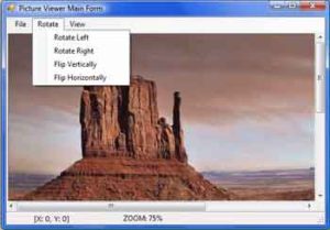
Open the Scrolling PictureBox project, shown in the following figure, and experiment with large images. The sample project’s main form contains a menu and a status bar, which remain in place as you scroll the PictureBox control with the image in the Panel control. The menu contains commands to zoom in and out of the image as well as commands to rotate the image.


I’ve also added a few statements to display the coordinates of the upper-left corner of the visible section of the image and the current zoom on the form’s status bar. Every time the Panel’s contents are scrolled, the Scroll event takes place. I’m using this event handler’s arguments to read the horizontal and vertical displacement of the image and print them with the following statements:
Private Sub Panel1_Scroll(ByVal sender As Object, _
		ByVal e As System.Windows.Forms.ScrollEventArgs) _
		Handles Panel1.Scroll
	If e.ScrollOrientation = ScrollOrientation.HorizontalScroll Then
		X = e.NewValue
	Else
		Y = e.NewValue
	End If
	ToolStripStatusLabel1.Text = _
			"[X: " & X.ToString & _
			", Y: " & Y.ToString & "]"
End SubCode language: PHP (php)

